Monday, July 17, 2006

The Next Scrapbooking Video - Page Design 2

Ok, this is another scrapbooking ideas video from the mini-course - but I'll save some videos for the course only, and you'll have to sign up to watch them.

This one, to me, gives the most important tip of all concerning the design and layout of scrapbook pages. I've seen so many that look 'ho hum' after many hours of work - but if these tips had been followed, the impact would have been just perfect.

Please let me know if you try these tips and think it makes a difference.

Click here to watch the video.

Please come back to this blog soon.

Pet


technorati tags:, , , , ,

New Scrapbooking Video - Page Design

I'm just starting to write a mini-course on scrapbooking ideas. It will be free, and available when I've got my website up and running. So far I've made 3 videos to show how I design pages in scrapbook albums, and also to pass on important tips that I've learned over the years.

Here's the video from the first 'lesson' showing how I'm going to construct an album, have the pages opening nicely, allow for it getting thicker and decide on margins.

Unlike many people (or at least, people who haven't had the concept explained to them) I believe that margins are important.

Normal printed books have margins around the text for a good reason. It makes your eyes focus on what's important, gives the subject matter more impact and it's easier on the eyes.

Of course, there are occasions when we can choose to break the rules, but it's good to know what works best for most of the time.

Anyway, here's the video.

Click here to watch

I hope you'll return to this blog and also sign up for the free mini-course. I'll let you know when it's available.

Pet


technorati tags:, , , , ,

Saturday, July 15, 2006

Calligraphy and Scrapbooking

Here's me, showing off a bit!

Calligraphy can be used to create many headings and titles for scrapbooking pages. Over the next few days I'll make another video showing you ideas for how it can be used for page background designs too.

And now the truth comes out! The Pet of my name stands for Peter. My initials are PET - so I've been called Pet a lot! (And I couldn't use Peter Taylor twice to sign on with Blogger in different accounts. As you'll see, I have another blog dedicated purely to calligraphy, and will soon have associated websites too.)

I hope you'll like this video showing some of the possibilities- not only for scrapbooking:

Click here to watch the video

Pet (Peter)

technorati tags:, , , , , ,

Monday, July 10, 2006

Page Design by Hand

If you are scrapbooking a mini-album featuring a young child, one idea is to design the pages to be the size and shape of their hand.

Draw round their hand to create a template, but maybe changing or adding on to the wrist area so that the finished book can easily be bound by your favorite method.

Use it to trace round to create other pages the same shape. Photos can be mounted into the palms, and journalling written on the fingers ... if you can write small!

Backgrounds on large sized pages can be produced by using hand-prints. I'd plan out where I want the prints, and cut slightly larger holes in these places on a waste sheet of paper to be used to keep other areas clean.

Poster paint or gouache paint (artists' quality poster paint), mixed with water to a creamy consistency, can be used. You could dab it on to the child's hand with a make-up or other  sponge, and then guide the child to place it's hand inside one of the cut holes - but be prepared for some failures. You can always glue on embellishments to  cover smudges or  unsatisfactory areas.


technorati tags:, , , ,

Friday, July 07, 2006

Scrapbook Title Letters

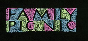
Hey, it works - I can do pictures for you - well snippets anyway. I'll work on big pages later. Scrapbooking and blogs are fun!

This is just an idea for a title.

I ruled lines on black card using a pencil and drew some hollow letters. It was easy to make these lines of writing end up at the same place. I wrote the words out roughly on a scrap piece of paper first so I knew how much space they were likely to take up. As the lines were nearly the same length I knew they had to end up perfectly alligned, so on the second one I wrote 'pic' first, then matched up the 'c' of nic under the y and worked backwards, then finally added the hyphen.

The coloring was done with gel-pens. I'm not sure how long the ink will last, but I'm sure it'll be for a long time.

This design only works because there is very little black left in the spaces between letters. The texture is actually made up of little clockwise and anti-clockwise spirals, with the letter outline color matching the texture color.

Cheers for now,

Pet

Journaling

Have you ever added up the value of all those little bits and pieces you've bought and collected, and which are laying around your work area or hidden away? Frightening! I daren't. I could have owned an extra house by now.

I'm sure I'll continue to be unable to resist temptation everytime I go near a shop, but I really need to slow down buying stuff.

In the past I've tried to follow all the latest and greatest scrapbooking ideas and trends, added all the new embellishments but ended up with pages that looked 'sort of good' - but a bit like everyone else's, and felt 'I really want pages uniquely my own'.

Fortunately, I've learnt many papercraft skills from the best over 30 years or more, and so I'm trying to incorporate my own handmade paper, cut my own rubber stamps, create special backgrounds, use calligraphy for titles, and much more.

In future posts in this blog I'll describe my techniques and show some of the things I've been creating. My friends say they like them - but the most important thing is that I like them and have lots of fun - and I hope you will too. (And I'm not spending as much.)

I'm pretty new to blogging, and I've still to find easy ways of putting up pictures of some pages.

Hopefully you'll keep coming back to this blog - I'll have lots to show you soon.

This is not quite scrapbooking - but it's a piece of my calligraphy. I hope you like the saying it's my favorite. This is my simplest way of laying out a journaling page. The story is true. It was told me a shopkeeper (Malcolm). In the end I hope to bind together whole series of stories illustrated like this, but I haven't decided if they really need extra embellishment or not.

Here's the story, so you can read it:

Gerry was getting old, but he planned to build a room under his house, so that he and his mates could play pool. He had been digging out soil with a pick and shovel for months, and he was exhausted. When Malcolm, and his new employee, Paul, had finished using their excavator to create a new driveway for the neighbors, Gerry asked Malcolm if the two of them could finish levelling the floor for him with their machine.

"Sure, Old Fella!'" said Malcolm, and he and Paul spent half a day getting it just perfect.

"How much are you going to charge him for that?" asked Paul.

"Nothin'"

"You must be crazy! You'll go broke in no-time!"

"What goes around, comes around!" replied Malcolm, and away they drove.

Two days later Malcolm and Paul were at another job, demolishing a retaining wall, and had a truck-load of soil and concrete to dump. Malcolm sent Paul off with the truck and a hundred dollars to pay the tip-fees.

When Paul returned, he told Malcolm that the man on the gate had taken one look at the name on the side of the truck and let him through without paying. "I know what you did for old Gerry, who lives opposite me!" he said.

"I told you 'What goes around, comes around'!"

Malcolm and Paul continued to be waved through the tip gate, free of charge, for the rest of the time that the same man worked there. Malcolm reckoned his small deed of kindness ended up saving him over twenty thousand dollars.

Take care and have a good weekend.

Pet

PS I've got a friend called Marg who's fantastic at journaling. And scrapbooking. We started blogging at the same time. If you want some great journaling tips, and other useful scrapbooking information, you may like to follow her blog as well. You'll find it at

http://www.scrapjournal.blogspot.com/

.... well, at least, I hope you'll come back to mine.

If you want to put mine into your 'My Yahoo' or feedreader, so you get it automatically, it's

http://best-scrapbooking-ideas.blogspot.com/atom.xml


technorati tags:, , , ,

Wednesday, July 05, 2006

Scrapbook Size

I like to make my own scrapbooks, both full size and mini-books.

When I design scrapbooking pages I always try to create margins that help the pages look good.

Here's one recipe I use a lot:

"A good, pleasing, starting point is for the book to be rectangular when closed, with the long side : short side in the ratio of 4 : 3.

Traditional proportions are calculated in 1/16ths of the longest side. For a book with pages in the 4 : 3 ratio, these have been 2/16ths at the top, 4/16ths at the bottom, 3/16ths at the outer sides and 1½ /16ths for margins either side of the fold.


If the page dimensions are closer to 2 : 3, the margins may look better with proportions around 1/16th of the longest side for each inner margin, 2/16ths for the fore-edge (front edge parallel to the crease), 1½ /16ths on the top and 3/16ths on the bottom.

Of course, these are just a guide, and you can choose whatever proportions you like best. Many people decrease the size of the inner margins in particular."

...But I also like to create square mini-books and all kinds of shapes and sizes.

Right now I'm working on a triangular book idea. It will lay flat but open up to make a pyramid.

Have fun,

Pet

PS Please add this blog to your feed reader:

http://best-scrapbooking-ideas.blogspot/atom.xml

technorati tags:, , , , ,

Tuesday, July 04, 2006

Paper Tearing Idea

I like those scrapbooking ideas that don't cost a lot of money to use. Paper tearing is great.

There are lots of superb ideas at www.onescrappysite.com - and Sarah Devendorf describes tearing techniques perfectly at

http://www.onescrappysite.com/modules.php?name=Sections&op=viewarticle&artid=78

I've used tearing in many different ways. It's particularly good for suggesting clouds and waves too.

Nice one, Sarah!

If anyone would like to add a picture of their work, please let me know.

Pet


technorati tags:, , ,

Monday, July 03, 2006

Scrapbook Page Designs

Ideas for scrapbook pages can be found wherever you find a scrapbooking website.

Today I was looking at http://www.geocities.com/scrapbookingsite/

It's a great site with lots of ideas and resources. You may like to check it out. It has lots of nice pictures like these.


Thanks guys!

Of course there will always be some pages, in any site or magazine, that you like more than others, and that helps you work out what you need to do to make your own pages look special.

The things I always ask myself are

  • Can you easily tell what the the theme of the page is?
  • What is the first thing that attracts your eye? I think it's pretty obvious in these two pages.

I believe every page needs a focus. Do you agree?

Have Fun

Pet :)


technorati tags:, , ,

Welcome to Best Scrapbooking Ideas News

Welcome to my new blog!


Here I'll try to keep you up to date with all the latest scrapbooking news - especially scrapbook page design ideas.


I hope that I'll provide lots that's useful to you.

Please leave a comment if you like what I post, would like to share your own ideas, want to suggest what you would like me to provide - or describe problems that you'd like some ideas for solving.

Happy scrapping!

Hope to see you back often!

Pet :)